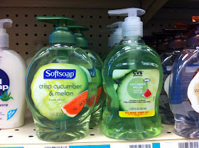
I have a longstanding interest in house brands that imitate aspects of national brand formulation and trade dress. Here's a recent example from CVS, which is notable not just for the scent combination (I imagine counsel was fairly confident that it's legit to show pictures of cucumber and watermelon to indicate the characterizing scents even if the national brand does too) but for the size. Ordinarily, larger sizes take up more vertical and horizontal space, but this one apparently is designed to look like the smaller national brand, so it simply extends farther back and then promises 50% more on the bright yellow strip at the bottom: 11.25 oz. v. 7.5 oz. I wonder if consumers notice that it's really bigger?
For contrast, a more standard variant (sorry for the out of focus picture) with milk and honey as the scent/pictures and a similarly shaped bottle, using color and house brand to distinguish the two:


No comments:
Post a Comment